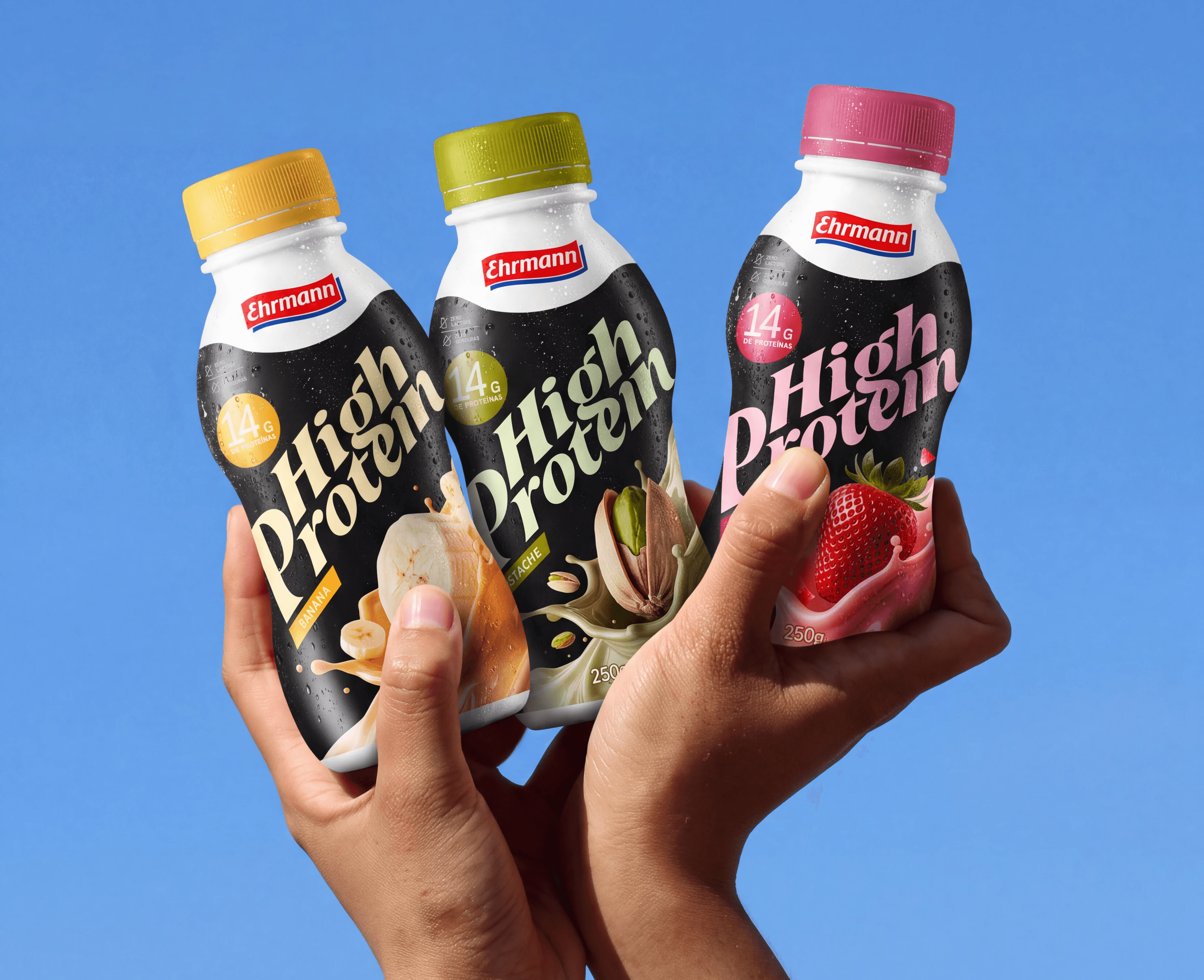
I tried High Protein by @ehrmannbr and really liked the product, but I felt the packaging could have more personality.
Original design.
In the current version, many elements compete for attention on the front. There’s a lot of information, but the hierarchy could be clearer to better guide the eye. That became the starting point for my redesign.
The proposal combines a stronger visual identity with a clearer hierarchy, making the product and its different flavors easier to recognize on the shelf.


NEXT PROJECT →